CSS animations have been around for quite some time, and implementing them is easier than you think. Join me in this article, where we are going to define all that you need to know to learn how to use CSS animations.
When shall I use CSS Animations
It is quite hard to find the right amount of animations to include in your site. We are all used to see effect when hovering a button, or clicking a link, but adding more can be complicated at times.
CSS animations are a double edge sword. In other words, use them in moderation and in the right places, would support your site User Experience (UX). However, add to many or place them in the wrong place, would result in a drop in Web traffic.
In my past experiences I have learned and followed these rules when adding an animation, and support your site UX.
- Short duration: Animation should not last long, because they will cause the user to lose focus. Usually, I aim for a max of 0.7 seconds and, on average, 0.4 seconds.
- Triggered by action: Always trigger animations following a user action like hover, scroll, click, etc..
- Less is better: Do not overdo with animation. A small action is better than an explosion of effects.
How to write CSS animations
The CSS animation can be achieved using two different CSS properties:
- Animation
- Transition
If you want to find out more about the two properties mentioned above, see my other post CSS3 Animation vs CSS3 Transition
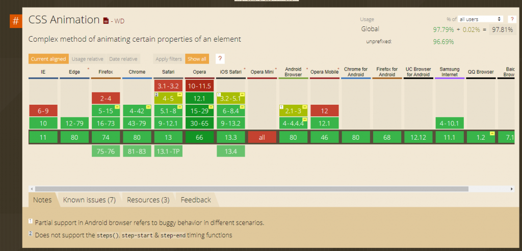
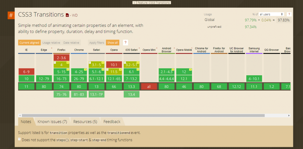
Both features are widely supported in major browsers, offering full support from Internet Explorer 10. The tables below shows the current support as shown on caniuse.com


There are multiple properties used when writing pure CSS animations. For instance animation-duration, animation-name and animation-timing-function. However, it is very common to use the shorthand “animation“. The same can be said for transition too, as it offers a very similar list of properties and a handy shorthand.
My personal definition of an animation is:
The possibility to create a specific effect on one or more CSS properties, affecting HTML elements, during a defined length of time.
Simone Cuomo
In the following sections we will code real life example, that will support you in understanding the different CSS properties available.
Basic example – opacity on hover
One of the most common effect to create, is the ability to change the opacity level of an image when hovered.
This effect is quite useful as it helps the user to focus his attention to the hovered picture.
To better understand animation, I am going to use the individual properties for some of the following examples, instead of the animate shorthand
In our first step we are going to create an image group and assign it some design properties:
HTML
<div>
  <img src="https://picsum.photos/200/300" alt="random image" />
  <img src="https://picsum.photos/200/301" alt="random image" />
  <img src="https://picsum.photos/200/302" alt="random image" />
</div>
CSS
img{
  opacity: 0.3;
}
Next, it is time to define an hover effect for our image. At this stage, we are not implementing any animation, but just a simple effect.
CSS
img:hover{
  opacity:1;
}
Finally, it is time to implement our animation. Given the fact that we are implementing an animation to be triggered from an event (hover), we will use the CSS 3 Transition property.
The property provide less control, but a simple implementation, and it is great for simple effects.
img{
  opacity: 0.3;
  transition-duration: 1s;
}
The only required field for our animation is the overall duration. So the above code will make sure the transition between 0.3 opacity and 1 takes 1 second.
It is a matter of speed
As you have probably noticed from the above example, the animation works in both ways. Once when hovering (entry animation) , and when returning to the default state (leaving animations)
If your animation is applied to a list of items, like in our case. It is suggested to vary the timing of execution of the animations. More precisely, it is important that the main animation, in our case the hover effect, should last longer than the leaving ones.
This behaviour can be achieved by overriding the transition-duration property. In the “enter” declaration, in our case :hover , we set the duration to apply when we hover the image. In the img declaration we define the “leave” animation duration.
img{
  opacity: 0.3;
  transition-duration: 0.5s;
}
img:hover{
  opacity:1;
  transition-duration: 1s;
}
All animations property can be overridden between states, offering endless possibilities.
When discussing speed in animation, we cannot mention the transition-timing-function . This property specifies the curve of the transition effect. An example of one of this property in real life could be a soft closing drawer. This drawer starts their motion fast, and then slows down at the very end. This is precisely the definition of one of the value available for this property ease-out.
Without going into mathematical explanation, the values or this property, as define on the w3school site are:
ease– specifies a transition effect with a slow start, then fast, then end slowly (this is default)linear– specifies a transition effect with the same speed from start to endease-in– specifies a transition effect with a slow startease-out– specifies a transition effect with a slow endease-in-out– specifies a transition effect with a slow start and endcubic-bezier(n,n,n,n)– lets you define your own values in a cubic-bezier function
Even if the changes can be hard to see at naked eyes, their usage is suggested for any sort of animation. There are numerous articles that explain when and how to use the individual property. I usually like to use the `ease-in-out` value.
img{
  opacity: 0.3;
  transition-duration: 0.5s;
  transition-timing-function: ease-in-out;
}
img:hover{
  opacity:1;
  transition-duration: 1s;
}
Executions delay
In this paragraph we are going to emphasise one of the point raised above. The necessity to reduce animation to the minimum. To capture the user focus at the right time.
There are times when a small delay, in the animation execution, can really help the user to focus. For example, wiggling a submit button if a user has not completed a form, or animate a message icon when to remind the user to read inbox.
In addition, animation delay are also used for more complex animation routine. The following Codepen, shows an example of animation-delay property. In the following case we are emulating a traffic light effect on hover.
It’s animation time
Until now, we have just focused on the transition property, as it provides a simple “intro” for beginners. It is now time to introduce the animation property. The use of CSS3 animation is somewhat harder than its counterpart CSS3 transition, but it also offer greater control.
The main reason why I have introduced transition first, is because all the properties mentioned so far, are available within the animation counterpart:
- animation-delay
- animation-duration
- animation-timing-function
In addition to the properties already covered, there are more controls available for us:
- animation-name
- animation-iteration-count
- animation-fill-mode
- @keyframes
To help you understanding the main difference between animation and transition, we are going to replicate the above codepen using animation. To do so, we will have to implement a couple of modifications.
animation-name
All animations are called by name. This name is going to be attached in the declaration that we want to animate:
#container div{
  ...
  animation-name: trafficLight;
}
Keyframe
Then, it is time to move the animation logic within the @keyframes property. This property can either accept two values (from, to) or it can accept arbitrary percentage, that reflect the animation duration (20%, 75%). In the following example we are going to define the first example, using from-to:
@keyframes trafficLight{
  from { height: 0px; }
  to { height: 100px; }
}
Retain state
Using CSS3 Animation instead than CSS3 Transition would produce an unexpected behaviour. In fact, effects produced with the animation property will return to their initial state by default.
In our case, the boxes that symbolise the traffic light colour will go back to their initial state at animation completed, as shown in the following gif:

To force the CSS3 animation to keep it state, we will have to use another property called animation-fill-mode.
This property is used to specify the value applied to element before or after its execution. In our case we are going to use a value of “forwards”. Doing so, will incur in our element to keep the same state used in the last @keyframe of our animation ( in our case, height of 100%).
The following codepen shows the result of out latest addition to our animation code. Do not forget to look at the CSS tab to see the animation implementation.
Complex Keyframe
We are at the end of this article in which we introduced CSS3 animations. In our latest example we are going to enhance the above example to show the power of animations (and what makes them different than transitions).
The power of animations, is in the possibility to define different “stages” of the animation, using the @keyframe values. In our case, we are going to set 5 different steps. Each step can include as “effects” as we want.
It is important to realise that the @keyframe are set with a percentage value, and this will be calculated using the overall animation duration.
For example, if you want a box to change the colour every second for 3 seconds, you will set three keyframe, one at 33%, the second at 66% and lastly one at 100%. This in conjunction with an animation-duration of 3 seconds will provide you the desired effect.
In our last code example, we are going to replicate a similar effect than the one shown before, by using a single empty DIV. To fully show the power of keyframe, we are changing two properties for each keyframe effect.
Conclusion
It is now time to wrap things up. In this article we have introduced many animations and transitions properties. In addition, we have also defined how to use them, and the implication that they have to the end user.
The topic is quite vast, and there are still many more properties and complex use cases that are out of the scope of this article. If you have enjoyed this post or have any feedback, please leave a comment below.
Now, it is time to…


So you state a rule of .5s for an animation and .7s max. Yet the very first animation you introduce is 1s. Makes sense…
Brad, the animation timing within the example is different as I had to properly display the difference in time for the user to understand it. When using fraction of times it is harder for people to then learn what is the entrance and the exit CSS declaration. In actual website I follow the rule suggested above.