
I have been developing for over a decade and creating Dynamic “font-size” has always been a long-discussed requirement. Until now, this feature was always achieved with the use of Javascript to support the font to scale up and down to fit within the container. Luckily for us, with the advances in CSS, we are actually able to fully implement this feature directly in CSS with no need for additional plugins or requirements.
TLTR; You can use CSS clamp property to set dynamic fonts as shown in this codepen
Reason to implement responsive font-size
By “responsive font-size” we refer to the ability for the text size shown within our web application to change in size depending on the size of the screen or container to allow it to fit.
In my career, I have encountered many different reasons that required “font-size” to be dynamic, but I can split this into two main categories: dynamic space and dynamic text.
Responsive font-size with dynamic container size in plain CSS
Responsive design is everywhere, and with it comes the need to create a UI that flexes around to provide the best user experience (UX) to our users. With responsive designs also comes the need for a responsive font. Usually, we solve this problem by setting out font size within our “breakpoints” For example, on desktop we set the font to 1.5rem, and on mobile, we set it to 1.24rem and so on.
The above solution is good for what it offers, but it does not really makes our font dynamic. In the next chapter, we are going to show how to make solve this with just one single line of CSS
Responsive font-size on dynamic text length in plain CSS
The second scenario that requires us to create dynamic font has become more common in recent years with the growth of Single Page Applications (SPA) that helped us to create dynamic websites.
Until Javascript and frontend framework, the content was pretty static on the pages and designs were “locked in”. As pages became more dynamic, so did the content that they provide.
With very dynamic data also comes the need to flex the font size to help it fit within a given space. This is very common nowadays for dynamic titles, dynamic popups and so on.
Pure CSS way to make font-size dynamic
The time has come to show you how to make your typography fluid. As I mentioned above this is going to be a plain CSS solution and it is going to be pretty simple as it is just going to introduce a single CSS declaration.
To be able to create fluid typography we are going to use a CSS feature called clamp. The description clamp is:
The
https://developer.mozilla.org/en-US/docs/Web/CSS/clampclamp()CSS function clamps a middle value within a range of values between a defined minimum bound and a maximum bound. The function takes three parameters: a minimum value, a preferred value, and a maximum allowed value.
This CSS function allows us to define a set of values that will be used for our font to fluctuate.
The clamp feature includes 3 required arguments:
- Min: The minimum value
- val: The desired value
- Max: The max value
NOTE: As you can see in the description and also the parameter description, the clamp feature is not only defined for font but it can be used for anything that requires a range of values.
How to use clamp to make font-size dynamic
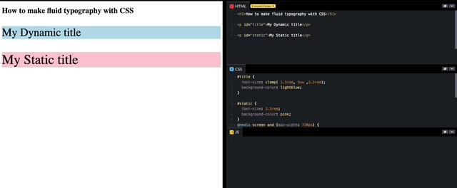
In the following example, I created two <p> elements. One with dynamic font using clamp and the other with a static font using REM and breakpoints.
If you play around with the width of the screen you will see that the first heading is fluid and its size changes as the container resizes, while the second “jumps” at specific breakpoints.
To make the font we used the following CSS code:
font-size: clamp( 1.5rem, 5vw ,3.5rem);This code as mentioned above uses the clamp CSS property with its 3 values. In our case, we have set the values to be a minimum of 1.5rem, a maximum of 3.5 rem and a dynamic size that in our case is set at 5% of the view width (in a 900px that is around 2.8rem with a base font of 16px).
Conclusion
The clamp function is very powerful. In this example, we have shown how to implement it using font, but this can be applied to everything (width, height, border, padding).
I am always surprised by the recent advantages of CSS and I really hope that you will find good use of the above content in your project!