
If you have been in web for as long as I have, you should have at least once in your career, have to create a slideshow or an layout that required two element to be on top of each other.
This requirement is usually determined, by the need for animation that would transition between different images or different pages. A very common example of this s the fade out fade in effect that many sites provide:
The Gif above shows the effect of two overlapping elements, one with a content called “Child 1” and the other with content named “Child 2”. This two-element that are positioned on the same spot on the viewport, come in and out of view creating a fade effect.
This practice has been around for quite some time and it has been achieved until now using position absolute to place the components on top of each other.
Unfortunately, as explained in the “developer.mozilla.org” site, using position absolute results in the document being removed from the natural flow, and no space is created in the page layout.
What time means is that while position:absolute helped us achieve this stacking effect, and it also produced some unwanted consequences to placing the element correctly within the document layout.
Solving height and positioning issues raised by position:absolute has actually resulted in many JS and Fixed height hacks.
Use CSS grid to place two element on top of each other
Has previously mentioned, I am extremely grateful for the above solution that helped me in old browsers that have very limited support. But in today’s world, where even our greatest enemy IE11 has finally been defeated, it is time to move on and try to create solutions that produce a better result with limited side effects.
Today’s solution is going to be implemented using CSS grid and as far as I know, it seems to be playing well in mostly every major browser I was able to try.
The idea is to emulate the stacking element, by creating a grid layout where 2 elements are forced to be in the same column and row.
The first step is to define our HTML element:
<div class="container_row">
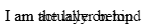
<div class="layer1">
I am the layer behind
</div>
<div class="layer2">
I am actually on top
</div>
</div>In the code above we have just created a container using the HTML element <div> with a class of “container_row” and two others <div> with a class of “layer1” and “layer2” respectively. These two elements are not currently stacked on top of each other, but are rendered next to each other, as expected from a simple <div>.
Our next step is to define our CSS by defining a grid layout and forcing the two divs to be placed in the same spot of the grid:
.container_row{
  display: grid;
}

.layer1, .layer2{
  grid-column: 1;
  grid-row: 1;
}
The code above is quite simple and self-explanatory. First, we define the container to be displayed using the grid layout, and then we force the two div that contain our text to use the same grid position, in this case, row 1, column 1.
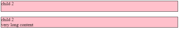
A visual representation of the above code would produce the following result (not pretty but effective);
Both texts are showing on top of each other, accomplishing what we wanted to achieve as part of our exercise. Before completing this post, I am going to enhance he code to make it more usable and help provide more context. To do so we are going to add some background color and differences in font color to the two elements:
.layer1{
  color: blue;
  background: red;
}

.layer2{
  color: white;
  background: blue;
}
Next, we are going to add some animation to fade in and out the two elements:
.layer1, .layer2 {
  animation-name: fade;
  animation-duration: 10s;
  animation-fill-mode: both;
  animation-iteration-count: infinite;
}

@keyframes fade {
  0% {
    opacity: 0;
  }
  100% {
    opacity: 1;
  }
}
Lastly, we are going to add another div below out existing text to show that the elements are now part of the layout.
<div class="container_row">
    <div class="layer1">
        I am the layer behind
    </div>
    <div class="layer2">
        I am actually on top
    </div>
</div>
<div class="container_row">
   Yuppi! This line is positioned successfully! This would not have been the case with position:absolute
</div>
The full code can be seen and accessed in the Codepen below:
NOTE: The animation is not showing until you open the page in codepen.
Conclusion
I am always very excited when I see new technologies being used to solve long-standing issues. I have shared this post in the hope that it is going to help some of you in achieving the above-mentioned layout without having to result in years-old solutions that are now overdated.
If you are going to use the above trick anywhere, please post it in the comment below to share more context for new readers and help this approach become the new standard.